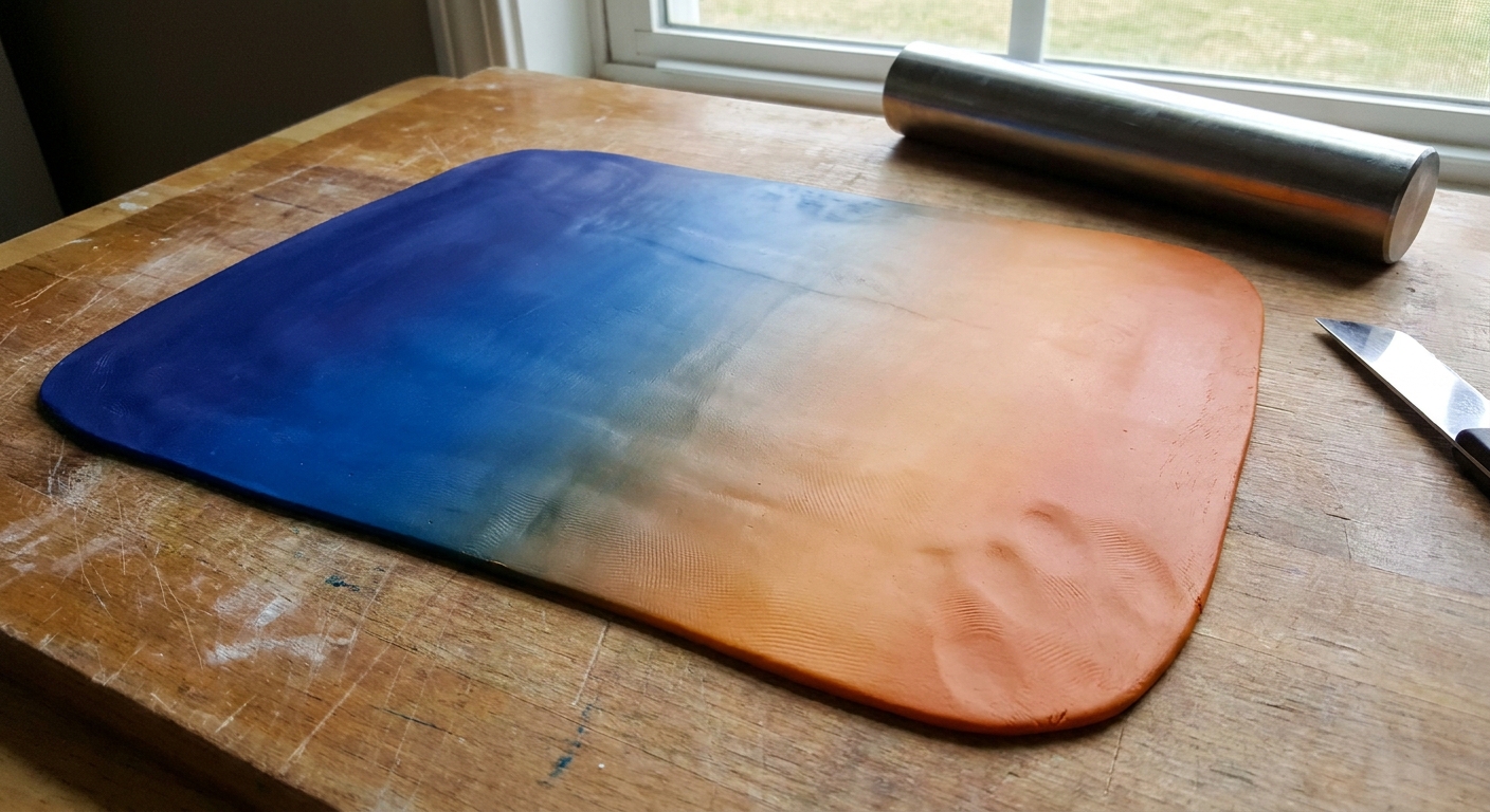
Create flawless polymer clay gradients with the classic Skinner blend. Step-by-step pasta machine and hand methods, plus color pairing tips and easy fixes fo...
Polymer Clay Color Mixing for Boho Palettes

Dimple
Dimple is the cheerful hamster host of Clay Bakehouse who absolutely loves transforming brightly colored clay into tiny, adorable masterpieces. Whether readers are rolling their very first clay ball or baking delicate custom earrings, Dimple is always there with a warm smile to celebrate every squish and shape.
Published · Last updated
Let's roll out some colorful clay and make something wonderful today! If you love that cozy boho look, the secret is not buying a hundred colors. It's mixing a few basics into muted, earthy shades that play nicely together in earrings, pendants, and beads.
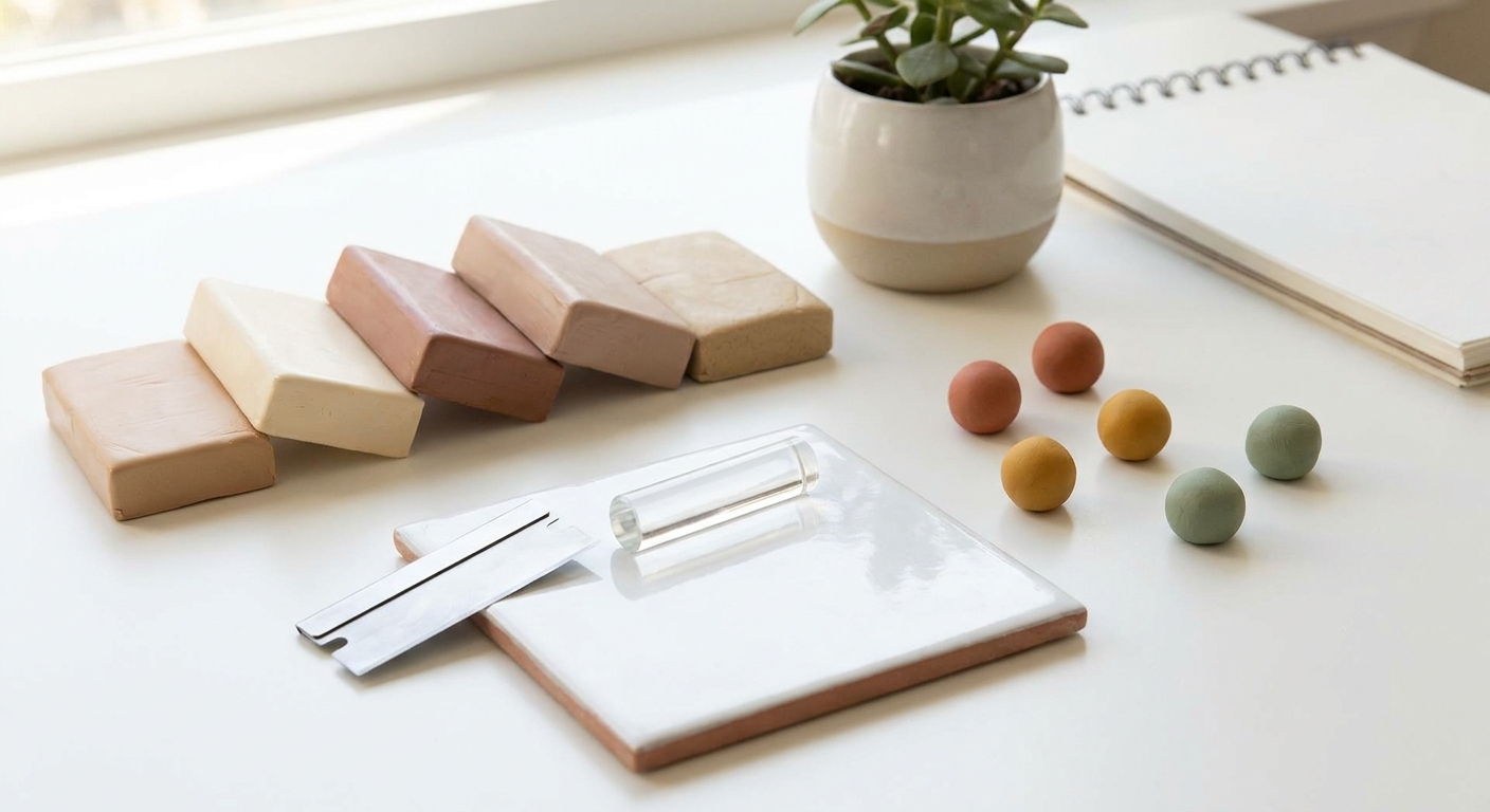
Boho color, in polymer clay terms
Boho palettes usually feel warm, soft, and a little dusty. Instead of bright primary colors, you will see lots of:
- Warm earth tones (terracotta, clay red, caramel, ochre)
- Muted greens (sage, olive, eucalyptus)
- Soft neutrals (cream, sand, warm gray, cocoa)
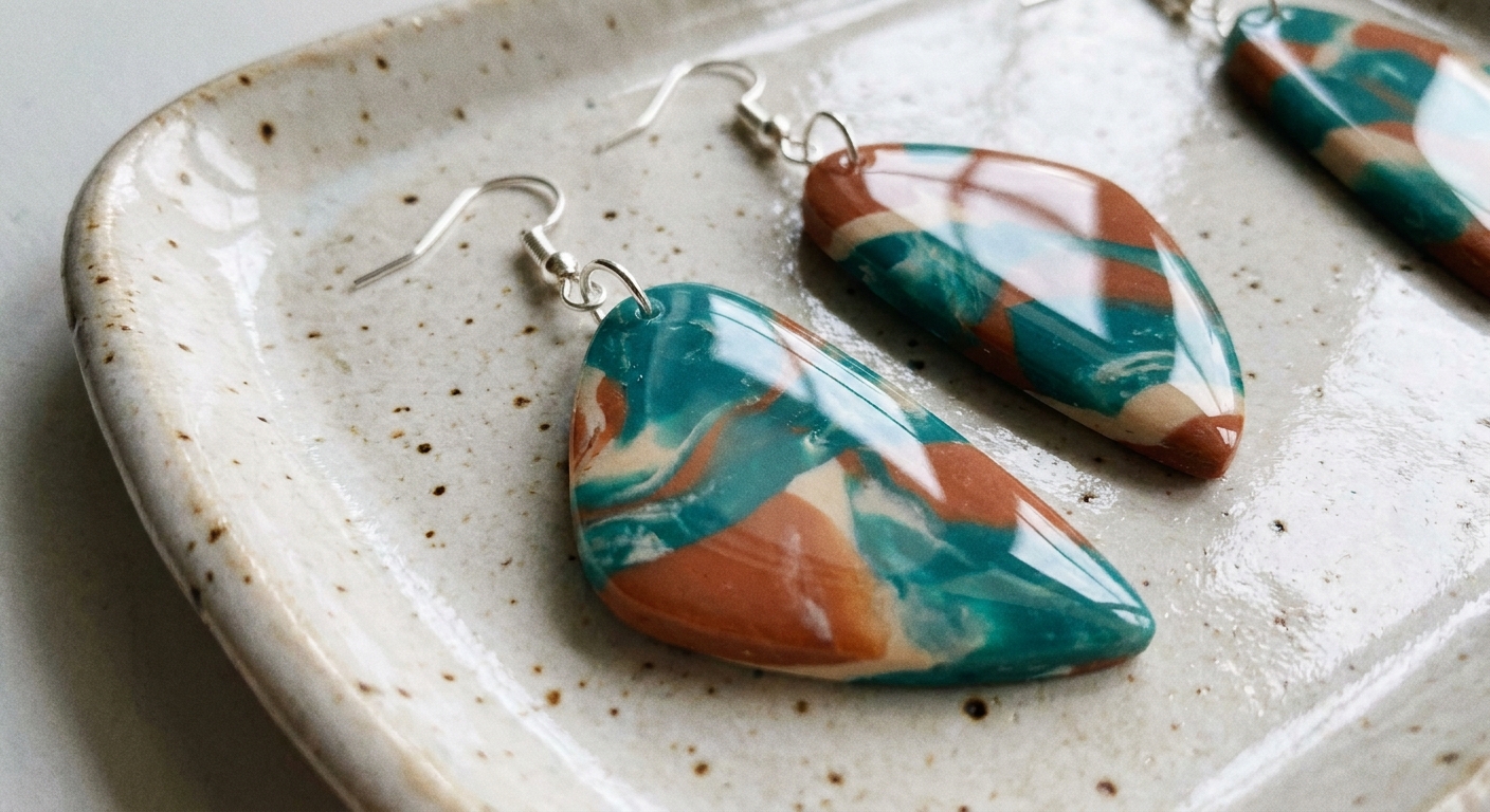
- Washed accents (dusty blush, faded teal, mauve)
The most important move is learning how to mute a color on purpose, without making it look muddy.
Quick clay color theory
1) Tint, tone, shade
- Tint: add white to lighten and soften.
- Tone: add gray or a complementary hint to mute (this is the boho magic).
- Shade: add black or dark brown to deepen.
2) Warm vs cool changes the vibe
A warm white (slightly creamy) makes terracotta and mustard feel cozy. A cool white can make colors look more modern and crisp. Same idea with blues and greens: a tiny warmth shift can make a shade look more natural and less neon.
3) Complementary colors mute each other
Opposites on the color wheel reduce brightness. Examples:
- Red mutes with a touch of green.
- Orange mutes with a touch of blue.
- Yellow mutes with a touch of purple.
This is often more controlled than adding black, and it helps colors stay earthy instead of turning flat.
Before you mix
Condition first
Condition each color until it is smooth before you combine. If you need help getting clay silky, visit How to Smooth Raw Polymer Clay.
Keep light colors clean
Boho colors live and die by clean whites and creams. Start with the lightest mixes first, wipe your tile between colors, and keep a baby wipe or rubbing alcohol nearby for quick hand and blade cleanups.
Pick a measuring method
Consistency is much easier if you measure, even loosely:
- Equal-size balls: fastest for beginners.
- Same-thickness snakes: cut equal lengths.
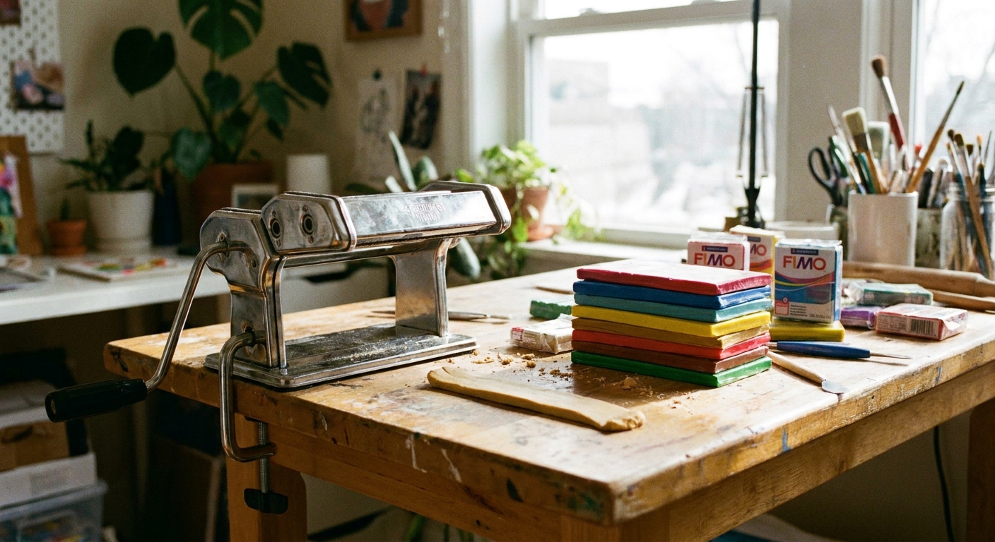
- Sheets: run clay through a pasta machine, stack layers, then cut.
If you use a pasta machine for sheets and blends, Pasta Machines for Polymer Clay has tips to keep things smooth and even.
Mix in small steps
Add dark or strong pigments gradually. It is much easier to darken a mix than to pull it back lighter.
One baking note (for color)
Overheating can darken or scorch clay, which can throw off your carefully mixed palette. Later, when you test-bake swatches, stick closely to your brand's temperature and use basic heat protection tools.
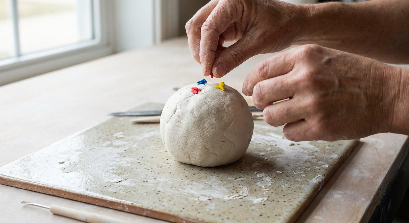
The Boho Base Set
If your stash is limited, these types of blocks are the most flexible:
- White
- Black (use sparingly)
- Warm brown (or chocolate)
- Yellow (a warm yellow is ideal)
- Red (or a warm magenta)
- Blue (a medium blue works well)
From these, you can build oranges, greens, purples, and most importantly, muted versions of each.
If you are still choosing brands and want similar softness and durability across blocks, Premo vs Fimo vs Cernit Polymer Clay can help you pick a consistent starting point.
Mixing ratios for boho colors
These ratios are starting points. Different brands (and different whites) vary, so treat them as a friendly map, not a strict rule. For each recipe, mix thoroughly, then adjust with tiny pinches.
Terracotta (soft clay red-orange)
- Base: 2 parts red + 1 part yellow
- Soften: add 1 to 2 parts white (until it looks sun-baked, not bright)
- Earthy mute: add a tiny pinch of brown
Too orange? Add a tiny pinch of red. Too pink? Add a tiny pinch of yellow or brown.
Burnt orange (deeper terracotta)
- 2 parts terracotta mix + 1 part brown
- If it goes too brown, add a small pinch of red back in.
Mustard (warm muted yellow)
- Base: 3 parts yellow + 1 part brown
- Soften: 1 part white (optional, for a creamy mustard)
- Extra mute: tiniest touch of purple or blue if it is still too bright
Tip: Mustard turns murky fast if there is too much brown. Add brown in pinches, not chunks.
Sage green (muted, gray-green)
- Base green: 2 parts yellow + 1 part blue
- Mute: add 1 part white + a small pinch of brown
- Optional dusty tone: a tiny pinch of the complementary color (red) to calm it further
Too minty? Add a pinch more brown. Too olive? Add a touch more white.
Olive (warmer, deeper green)
- 2 parts green base + 1 part brown
- Add a tiny pinch of yellow if it gets too dull.
Dusty blush (muted pink)
- Base: 1 part red + 6 to 10 parts white (pink happens fast)
- Mute: tiniest pinch of green or brown
Too peach? Add a pinprick of red. Too bubblegum? Add a micro pinch of green or a touch more brown.
Warm taupe (soft neutral)
- Base: 2 parts white + 1 part brown
- Cool it slightly: tiniest pinch of blue or black
Goal: a latte neutral that makes brighter accents look intentional.
Dusty teal (accent blue-green)
- Base: 2 parts blue + 1 part yellow (a greenish teal)
- Soften: 1 part white
- Mute: a tiny pinch of orange or brown
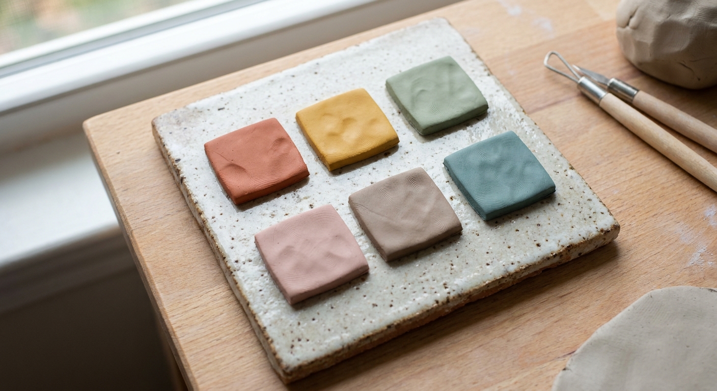
Muted, not muddy
Use brown as earth, not a shortcut
Brown is wonderful for boho palettes, but it can flatten your mix. Add it in tiny pinches, then knead fully before adding more.
Use complements in micro amounts
If a color looks neon, add a dot of its opposite (go slowly):
- Neon green: mute with a tiny dot of red.
- Bright orange: mute with a tiny dot of blue.
- Strong yellow: mute with a tiny dot of purple.
A complement can swing the mix toward gray fast, so always start smaller than you think.
Make a soft black for shading
Pure black can make clay look a bit harsh. For shadows, try mixing a deep brown with a tiny speck of blue, then use that to darken your palette.
Build a palette fast
- Choose your anchor: terracotta, sage, or mustard.
- Create a light neutral: creamy white or warm sand.
- Create a mid neutral: taupe.
- Pick one accent: dusty teal or dusty blush.
- Make a deep shade: cocoa brown or deep olive for contrast.
For jewelry, contrast is what keeps muted colors from looking flat. A deep shade next to a pale neutral makes everything feel richer.
Mixing for earrings
Make enough clay for a pair
For symmetrical earrings, mix a larger batch than you think you need. Small just-enough mixes are hardest to replicate.
Test at the thickness you will use
Color can appear different once it is rolled thin versus kept thick, especially with more translucent mixes and different finishes. Roll a small test sheet at the thickness you will actually use for your design, then bake a tiny swatch.
Plan the finish early
A glossy glaze often makes colors look deeper and more saturated, while a sanded or matte finish can make them look softer and lighter. If you are deciding on a topcoat, read Polymer Clay Glazes Explained.
Record your ratios
Keeping notes sounds boring, but it saves so much heartache when you fall in love with that perfect sage. Easy ways to track:
- Take a photo of the clay balls next to your blade for scale.
- Write ratios like R2 Y1 W2 + pinch Br.
- Make a tiny baked swatch tile and label it with a marker on the back after baking.
Common problems
My color looks speckled
Condition more, and fold and roll repeatedly. If one color is much firmer, warm it slightly in your hands before mixing so it combines smoothly.
My green turned gray and sad
You likely added too much complement (red) or black. Bring it back with a little yellow and white, then re-mute gently with brown.
My mustard looks dirty
Too much brown or too much complement. Add yellow and a little white to clean it up, then re-mute with a tiny pinch of purple or brown.
Everything I mix turns brown
That usually means your palette has too much brown or you are using complements too aggressively. Reset by making tints first (color + white), then warm them with micro pinches of brown.
A simple boho lineup
If you want a cohesive set for dangles, studs, and rings, try this five-color lineup:
- Terracotta: red + yellow + white + pinch brown
- Sage: yellow + blue + white + pinch brown
- Mustard: yellow + brown + optional white
- Warm taupe: white + brown + tiny pinch blue
- Cocoa: brown deepened with a touch of black (or a blue-brown mix)
Use taupe and creamy neutrals as breathing room between stronger colors in your slab designs.
If you are turning your palette into actual shapes, explore more ideas in Earrings & Jewelry.
FAQ
Does polymer clay darken after baking?
It can shift slightly depending on brand, temperature accuracy, and bake time. The safest method is to bake a small test swatch of your mixed color at your planned thickness. Good baking habits also help prevent scorching and unwanted color changes. If you are setting up your bake station, Essential Oven Tools for Baking Polymer Clay is a helpful checklist.
Can I mix different brands of polymer clay?
Often yes, but different formulas can feel softer or firmer. Mixing brands can change handling and, in some cases, final strength. This matters most for thin jewelry pieces that take daily wear. If you notice cracking or brittleness, consider sticking to one main line for your core colors, then experimenting carefully with small test batches.
Do translucent clays change mixed colors?
They can. Many whites and light neutrals have some translucency, which can make a color look deeper or slightly different after baking, especially in thicker pieces. If consistency matters, test-bake a small swatch and keep it as your reference.
What is the fastest way to make muted colors?
Start with a tint (color + white), then add a tiny pinch of brown to make it earthy. If it is still too bright, add a micro pinch of the complementary color to tone it down.